01Homepage Optimization
Autobrush
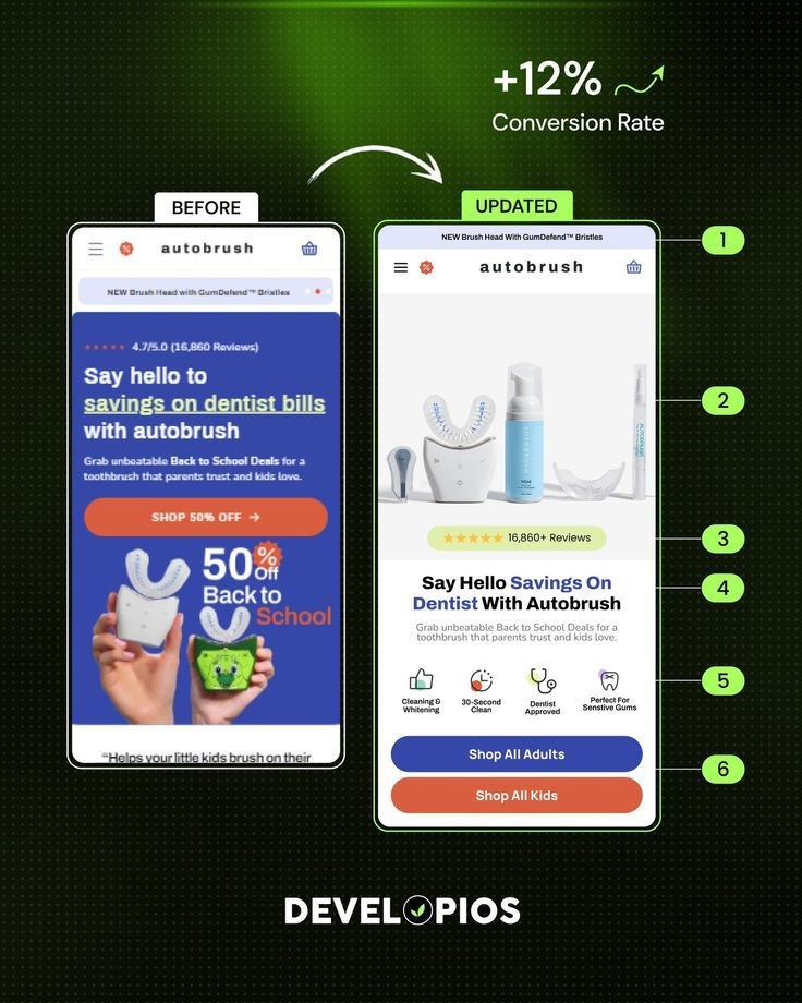
A promotion led mobile homepage was rebuilt around product clarity, review proof and two distinct shopper paths.
Mobile homepage above the fold
- Industry
- Oral care, direct to consumer
- Service
- Shopify CRO, Homepage Optimization
- Experience optimized
- Mobile homepage above the fold
- Technology
- Shopify, Replo, Figma
The problem we identified
- The first screen was dominated by a discount block, so a new visitor saw an offer before understanding what the brand actually sells.
- The product itself was not visible in the opening view, which left mobile shoppers guessing at the category.
- One generic call to action asked two very different audiences, parents and adults, to take the same next step.
What we changed and why
- We moved the product range into the opening view so the category is understood before any offer is read.
- We raised the review volume and rating into the first screen as immediate social proof.
- We replaced the single button with two clear paths, adults and kids, so each shopper self selects instead of hunting through navigation.
- We added a short benefit row that answers the first practical questions without requiring a scroll.
How the experience improved
- The opening screen now explains the product, the credibility and the two available paths in one view.
- Fewer shoppers need to scroll or use search before they can act, which shortens the route to a collection page.
Conversion and revenue figures are published only when the brand has documented them. Where no documented result exists, this case study describes the reasoning and the change instead.